Advanced Settings
The settings in this section are used to manage a variety of properties, including the ones shown below.
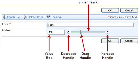
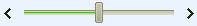
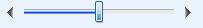
Slider Setup XML
Use this property to set up and configure the workplace slider field. This is an XML string that should contain a parent node called SliderProperties. The example provided below corresponds to the UI shown above.
Example:
<SliderProperties>
<AnimationDuration>500</AnimationDuration>
<ClickOffset>5</ClickOffset>
<ShowIncreaseHandle>true</ShowIncreaseHandle>
<IncreaseText>Increase Text</IncreaseText>
<ShowDecreaseHandle>true</ShowDecreaseHandle>
<DecreaseText>Decrease Text</DecreaseText>
<Length>200</Length>
<MinimumValue>100</MinimumValue>
<MaximumValue>200</MaximumValue>
<Orientation>Horizontal</Orientation>
<ShowDragHandle>true</ShowDragHandle>
<DragText>Drag Text</DragText>
<Skin>WebBlue</Skin>
<SlideStep>10</SlideStep>
<TrackMouseWheel>true</TrackMouseWheel>
<ShowValueBox>true</ShowValueBox>
<ValueBoxSize>75</ValueBoxSize>
<ValueBoxPosition>Left</ValueBoxPosition>
<DefaultValue>150</DefaultValue>
</SliderProperties>
AnimationDuration
Controls the duration of the animation that occurs when the slider track is clicked. This is an integer value that represents the time in milliseconds.
Default: 100
ClickOffset
Controls the number of positions the slider value will change when a user clicks on the slider track. The value provided must be an integer.
Default: 0
DecreaseText
A text value that controls the string that is displayed on the decrease handle end of the slider control.
Default: Decrease
DragText
A text value that controls the string that is displayed on the drag handle of the slider control.
Default:Drag
Enabled
A Boolean value that controls if the slider control is enabled and can be modified.
Default: true
IncreaseText
A text value that controls the string that is displayed on the increase handle of the slider control.
Default: Increase
Length
Controls the height or width depending on the orientation of the slider, including the handles.
Default: 100
MaximumValue
An integer value that controls the maximum value of the slider control that can be selected.
Default: 100
MinimumValue
An integer value that controls the minimum value of the slider control that can be selected.
Default: 0
Orientation
Controls the orientation of the slider control. Values can be Vertical or Horizontal.
Default: Horizontal
ShowDecreaseHandle
A Boolean value that controls whether or not the decrease handle will be displayed.
Default: false
ShowDragHandle
A Boolean value that controls whether or not the drag handle will be displayed.
Default: true
ShowIncreaseHandle
A Boolean value that controls whether or not the increase handle will be displayed.
Default: false
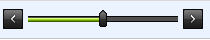
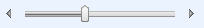
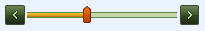
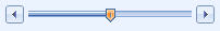
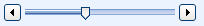
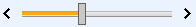
Skin
Controls the theme of the slider control.
Default: Vista
|
Available Skin Options |
Sample |
|
Black |
|
|
Default |
|
|
Forest |
|
|
Hay |
|
|
Office2007 |
|
|
Outlook |
|
|
Simple |
|
|
Sunset |
|
|
Telerik |
|
|
Vista (default) |
|
|
Web20 |
|
|
WebBlue |
|


SlideStep
Integer value that controls how much the slider moves when any of the handles are used.
Default: 1
TrackMouseWheel
Boolean value that enables whether or not the mouse wheel can be used to increment or decrease the slider control value.
Default: true
ShowValueBox
Boolean value that controls if a read-only textbox will be displayed that shows the numerical value of the slider control.
Default: false
ValueBoxSize
Integer value that controls the width of the value box if enabled.
Default: 50
ValueBoxCssClass
Controls the css style of the value box if enabled.
Default:
ValueBoxPosition
Controls the position of the value box relative to the slider control.
Options: Top, Bottom, Left, Right
Default: Right
DefaultValue
Text value that controls the default value.
Default:
Override HTML
A string value that provides a way to control how the slider control is displayed to the user. The slider and value box controls can be referenced by using the following:
Slider: [(Slider)]
ValueBox: [(Value)]