Form XML
In order to configure the BDF, you must create a configuration file which tells the BDF how to display an interactive form. The form is separated into seven main sections.
• Design – Controls the HTML display for the form.
• Controls – Specifies the interactive controls use on the form. For example, a Workplace Lookup pointing to a remote data provider.
• Form Response – Controls the type of response the user will see after the Submit button is selected.
• EditForm – Controls the mapping of data collected from a provider to the controls loaded into the edit form.
• DisplayForm – Controls the design and mapping of data collected from a provider to the controls loaded into the display form.
• LockFormType – Locks the display type of the form.
• BusyHTML – Controls the HTML displayed after the submit button is selected and the user is awaiting a response.
XML Reference
<Form>
<Design>
</Design>
<Controls>
</Controls>
<FormResponses>
</FormResponses>
<EditForm>
<Mappings>
</Mappings>
</EditForm>
<DisplayForm>
<Design>
</Design>
<Mappings>
</Mappings>
</DisplayForm>
<LockFormType></LockFormType>
<BusyHTML>
</BusyHTML>
</Form>
Form Design (required)
This is the HTML used to display your form. The use of "&" within an encoded value is not permitted. (E.g., )
Control Substitution
This allows you to specify and place a control at a specific location on the page.
[(CONTROLNAME)] = the name of the Controls specified in the "<ControlName>" node of the control you want to display.
Variable Substitution
REPLACEMENTVARIABLENAME = The name of the Replacement Variable that is captured from a post into the form. For example, if you want to use or show an ID in the form design that is passed into the page and you have specified it as "%CWID%" in your replacement variables, you can use "%CWID%" within the Design HTML. Requires the Replacement Variables property.
Design Example
<table cellpadding="0" cellspacing="0" style="width: 500px">
<tr>
<td class="ms-formlabel" style="width: 116px"><b>Priority Name:</b></td>
<td class="ms-formbody">[(PriorityName)]<![CDATA[ ]]></td>
</tr>
<tr>
<td class="ms-formlabel" style="width: 116px"><![CDATA[ ]]></td>
<td class="ms-formbody">[(SUBMIT)]<![CDATA[ ]]></td>
</tr>
</table>
Form Controls (required)
This is used to manage the Controls that are used within the Design node. At least one Control of any type and a Submit control must be specified in order for the form to be valid. The properties within each Control section correspond to nodes that manage that specific Control type.
XML Reference
<Control type="***ControlType***">
<ControlSettingNode1>…</ControlSettingNode1>
<ControlSettingNode2>…</ControlSettingNode2>
</Control>
All Controls
ReadOnly (optional)
Set to true to disable editing of the control value. Set to false to make the control editable.
Default: false
DefaultValue (optional)
Specifies a default control value to apply to the control.
ValidationRules (optional)
A set of validation rules to apply to the control.
Validation (required)
An individual validation rule to enforce. Any rules that fail validation will cause the form to not submit until the rules have been met.
• Type (Attribute) – The type of validation to enforce. Options:
A) Required – Set the value to true to make the control a required field.
1) Value – True or false
B) RequiredChild – Enforces that a child control is required if the value of the parent control is populated.
1) Value – True or false
2)Child – The control name of the required child control
C) FormatExpression – Enforces that the value of a control matches a regular expression.
1) Value – regular expression string to be applied
D) FieldCompare – Applies a comparison validation between two fields.
1) Child – The control name of the control to compare against
2) Value – The comparison type to perform. Options: greaterthan, greatereaqual, lessthan, lessequal, equal, notequal
3) ConvertValueTo – Performs a type conversion for value comparison. Options: Number, Date, String
• Message - The error message to display if validation fails. Use %FieldName% to substitute the name of the control in your error message.
Example:
<Control type="CheckBox">
<ControlName>TestField</ControlName>
<Text align="right">Test Field</Text>
<Checked>false</Checked>
<Value on="True" off="False" />
<ValidationRules>
<Validation type="required">
<Value>true</Value>
</Validation>
</ValidationRules>
</Control>
Auto Complete
ControlName (required)
The name of the control that will be used for mapping and form design.
Configuration (required)
Controls the setup of the Auto Complete control.
EnablePaging
A Boolean value that controls whether the Auto Complete drop-down control will display all of the items or display the items in page increments.
Default: false
CollapseAnimation
Controls the animation type the Auto Complete drop-down will perform when an item has been selected.
Options:
• Linear
• InQuad, OutQuad, InOutQuad
• InCubic, OutCubic, InOutCubic
• InQuart, OutQuart, InOutQuart
• InQuint, OutQuint, InOutQuint
• InSine, OutSine, InOutSine
• InExpo, OutExpo, InOutExpo
• InBack, OutBack, InOutBack
• InBounce, OutBounce, InOutBounce
• InElastic, OutElastic, InOutElastic
Default: Linear
CollapseAnimationDuration
An integer value that controls the duration in milliseconds that the collapse animation takes to perform.
Default: 300
EmptyMessage
A text value that controls the string that is displayed in the auto complete drop-down box when no items are present.
Default: No Items
SelectedItemsEmptyMessage
A text value that controls the string that is displayed in the selected items drop-down box when no items are present.
Default:
EnableLoadOnDemand
A Boolean value that controls if the auto complete field will automatically fetch data every time, or just when a user interacts with the auto complete control.
Default: true
EnableScreenDetectionBoundary
A Boolean value that controls if the auto complete drop-down controls will display themselves appropriately if located at the edges of the page. For example, if this is enabled and the control exists at the bottom of the page and there is no room to display the items in the drop-down box, it will force the items to appear on top of the control rather than below.
Default: true
NoWrap
A Boolean value that controls if the items in the auto complete controls can be wrapped or not.
Default: true
MarkFirstMatch
A Boolean value that controls if the first item in the auto complete control will be selected if any items are present.
Default: false
Height
An integer value that controls the height of the auto complete drop-down controls.
Default: 200
Width
An integer value that controls the width of the auto complete drop-down controls.
Default: 200
ShowDropDownOnTextBoxClick
A Boolean value that controls if the drop-down is displayed anytime a user clicks within the text area of the control.
Default: false
ShowToggleImage
A Boolean value that controls if the drop-down image next to the drop-down control is displayed.
Default: true
ShowWhileLoading
A Boolean value that controls if the drop-down controls are visible while the items are loading.
Default: true
Skin
Controls the theme for the Auto Complete controls.
Options:
• Black
• Default
• Forest
• Hay
• Office2007
• Outlook
• Simple
• Sitefinity
• Sunset
• Telerik
• Web20
• WebBlue
• Windows7
• Vista
Default: Vista
CollapseDelay
An integer value that controls the delay time in milliseconds that the auto complete drop-down controls will take to close once an item is selected.
Default: 500
CssClass
Controls the css class style that will be used to display the Auto Complete field.
Default:
EnableVirtualScrolling
A Boolean value that controls if the Auto Complete drop-down box will load items on demand while scrolling the drop-down box.
Default: false
ExpandAnimation
Controls the animation type that the Auto Complete drop-down control will perform when the control is selected.
Options:
• Linear
• InQuad, OutQuad, InOutQuad
• InCubic, OutCubic, InOutCubic
• InQuart, OutQuart, InOutQuart
• InQuint, OutQuint, InOutQuint
• InSine, OutSine, InOutSine
• InExpo, OutExpo, InOutExpo
• InBack, OutBack, InOutBack
• InBounce, OutBounce, InOutBounce
• InElastic, OutElastic, InOutElastic
Default: Linear
ExpandDelay
An integer value that controls the delay in milliseconds that the drop-down will wait to display items once the control is triggered.
Default: 100
IsCaseSensitive
A Boolean value that controls if the value being searched in the Auto Complete drop-down control is case sensitive or not.
Default: false
LoadingMessage
The text value that is displayed in the control while items are being loaded.
Default: Loading…
OpenDropDownOnLoad
A Boolean value that controls if the auto complete drop-down control will be open and ready for selection after the page finishes loading.
Default: false
RadComboBoxImagePosition
Controls on which side of the drop-down box the drop-down arrow is displayed.
Options: Left, Right
Default: Right
EnableMultiSelect
A Boolean value that controls if the Auto Complete field is capable of storing more than one selected value.
Default: false
BusyMessage
A text value that controls the text that is displayed when multi select is enabled and an action such as add or remove is being performed.
Default: Working
CreateNewItemUrl
Use this property to specify the URL that will be opened so that users can create additional/new Items without having to leave the current form. As with other CorasWorks URL properties, the site URL variables <%SiteURL%> and <%HostName%> can be used.
DefaultValue
A text value that controls the default value.
Default:
CharsToInitiateSearch
An integer value that controls the number of characters that must be entered before a search will be initiated.
Default: 0
ItemsPerRequest
An integer value that controls the number of items displayed and retrieved when paging is enabled.
Default: 10
UpdateFields
An XML string property that allows a user to configure the lookup so that when a value is selected, additional fields in the list are updated with content configured from the data source.
The Additional Update Fields property accepts an XML string that should contain the following schema:
<UpdateFields>
<Field>
<Title
InternalName="true/false">FieldName</Title>
<FieldValue>
1):xpath=xpath
value
2)<values>
<value type="xpath/text">xpath value or
text</value>
</values>
</FIeldValue>
</Field>
</UpdateFields>
For each field to be updated, there should be a field node that contains two child nodes: a Title node and FieldValue node. You can specify an internal field name by providing an InternalName attribute set to true in the Title Node. For the FieldValue node, you can provide a single xpath statement in the following format ": xpath=" with the right side of the equation being your query value.
In addition to the xpath query, users can specify a more complex value by utilizing the Values XML fragment as seen in the other properties. The XML should contain a parent node of values and child nodes of value. Each value node should have an attribute type set to either text or xpath. If text is specified, static text should be provided. Otherwise, if you have specified xpath, a valid xpath statement should be provided. The FieldValue node represents the data that will be stored to the field specified in the Title node.
Below is a sample of the property in use.
<UpdateFields>
<Field>
<Title
InternalName="false">Description</Title>
<FieldValue>
<values>
<value
type="xpath">CorasWorks/NewDataSet/Table1/Status</value>
<value type="text">
-</value>
<value
type="xpath">CorasWorks/NewDataSet/Table1/ListID</value>
</values>
</FieldValue>
</Field>
<Field>
<Title>test</Title>
<FieldValue>:xpath=CorasWorks/NewDataSet/Table1/Priority</FieldValue>
</Field>
</UpdateFields>
UrlToXML
The URL of the data source referenced by the Workplace Lookup to populate its choices. This property also supports the use of the variables <%SiteURL%> and <%HostName%>.
Default: empty
Examples: http://domain.com/LookupDataSources/Contacts
<%SiteURL%>/LookupDataSources/Contacts
URLToXMLFilter
This is a required setting; if left blank, no data will be returned. It establishes a connection to the filtered data source connection.
Note: The Workplace Auto Complete will pass a query string parameter "filter=" with the value of the search filter on the right side of the equation. If using the External Data Provider, you will need to make sure you have provided this parameter as part of the values nodes.
This property can be entered in standard URL format (http://www.yoursite.com/tasks.aspx) or using shortcuts such as:
• siteurl
• <%SiteUrl%>
• <%HostName%>
DisplayValue
The XML node location of the display text to be presented by the lookup to users as the choices for selection. This property can be specified in one of two ways:
1) A simple xpath query, represented by the following:
:xpath=(your xpath query here)
2) An XML string, which allows you to specify a more complex value consisting of multiple xpath queries and static text values. The XML string must contain a values root node with child value nodes representing your individual string pieces. The value nodes contain a single attribute type which tells the property whether it should treat the value as static text or an xpath query. The attribute values are type="text" or type="xpath".
Default: empty
Example: :xpath=NewDataSet/Table1/Title
<values>
<value
type="xpath">NewDataSet/Table1/Title</value>
<value type="text"> -
</value>
<value
type="xpath">NewDataSet/Table1/Description</value>
</values>
ValueMember
The XML node location of the value that will be stored in the SharePoint list when the item is selected and the list item is saved. This property is optional; if no value is provided, the lookup will utilize the value represented by the URL to XML . This property can be specified in one of two ways:
1) A simple xpath query, represented by the following:
:xpath=(your xpath query here)
2) An XML string, which allows you to specify a more complex value consisting of multiple xpath queries and static text values. The XML string will contain a values root node with child value nodes representing your individual string pieces. The value nodes contain a single attribute type which tells the property whether it should treat the value as static text or an xpath query. The attribute values are type="text" or type="xpath".
Default: The value of the URL to XML property
Example:
:xpath=NewDataSet/Table1/Title
<values>
<value
type="xpath">NewDataSet/Table1/Title</value>
<value type="text"> -
</value>
<value
type="xpath">NewDataSet/Table1/Description</value>
</values>
DataLinkValue
The XML node location of the value that will link the choice back to its parent details. This link is utilized on the item display form from within SharePoint. This property is optional. It can be specified in one of two ways:
1)
A simple xpath query, represented by the following:
:xpath=(your
xpath query here)
2) An XML string, which allows you to specify a more complex value consisting of multiple xpath queries and static text values. The XML string will contain a values root node with child value nodes representing your individual string pieces. The value nodes contain a single attribute type which tells the property whether it should treat the value as static text or an xpath query. The attribute values are type="text" or type="xpath".
Default: empty
Example:
:xpath=NewDataSet/Table1/Title
<values>
<value
type="xpath">NewDataSet/Table1/Title</value>
<value type="text"> -
</value>
<value
type="xpath">NewDataSet/Table1/Description</value>
</values>
DataKeyValue
The XML node location of the value that will be used by the Workplace Lookup to assign a unique identification key to each choice item. If the Lookup Configuration has been set up to utilize a different Lookup Value to Store and URL to XML, this property becomes required for the Workplace Lookup to function correctly. This property can be specified in one of two ways:
1)
A simple xpath query, represented by the following:
:xpath=(your
xpath query here)
2) An XML string, which allows you to specify a more complex value consisting of multiple xpath queries and static text values. The XML string will contain a values root node with child value nodes representing your individual string pieces. The value nodes contain a single attribute type which tells the property whether it should treat the value as static text or an xpath query. The attribute values are type="text" or type="xpath".
Default: empty
Example:
:xpath=NewDataSet/Table1/Title
<values>
<value
type="xpath">NewDataSet/Table1/Title</value>
<value type="text"> -
</value>
<value
type="xpath">NewDataSet/Table1/Description</value>
</values>
TIP: If there is no single value that you can use to uniquely identify each choice, try using the second property to join two or more values to create one unique value.
PTParams
Use this property to pass page parameters onto the page specified in the URL to XML property.
Example:
<PassThrough>
<Pass>
<PTType>get</PTType>
<PTRequest>SearchString</PTRequest>
<PTName>SearchString</PTName>
<PTDefault>[Me]</PTDefault>
</Pass>
</PassThrough>
Checkbox
ControlName (required) – The name of the control that will be used for mapping and form design.
Align (Optional) – Specify Left or Right to control the side of the checkbox where the text appears.
Checked (Optional) – Set to True to enable the checkbox by default.
On (Optional) – Control the value that is stored when the checkbox is selected.
Off (Optional) – Control the value that is stored when the checkbox is not selected.
Example
<Control type="CheckBox">
<ControlName>TestField</ControlName>
<Text align="right">Test Field</Text>
<Checked>true</Checked>
<Value on="True" off="False"/>
</Control>
Hidden
ControlName (required) – The name of the control that will be used for mapping and form design.
DefaultText (Optional) – Controls the default value of the hidden control.
Example
<Control type="Hidden">
<ControlName>MyHidden</ControlName>
<DefaultText>Text</DefaultText> (optional)
</Control>
ParentChild
ControlName (required) – The name of the control that will be used for mapping and form design.
Name (required) – The name of the drop-down control.
XMLToURL (required) - The URL of the data source referenced by the parent child to populate its choices. This property also supports the Common Use Variables stated at the beginning of this help topic.
DisplayValue (required) – The xpath value that will control the value displayed in the parent/child drop-down control.
ValueMember (required) – The xpath value that will control the value stored in the parent/child drop-down control.
Parent (Optional) – The name of the parent control that belongs to this child control.
DefaultText (required) – Controls the default drop-down value in the control.
AutoSelectFirstValue (Optional) – Set to True to have the first value in the control selected by default.
StaticItems (Optional) – A set of static items to append to the controls drop-down values.
Xml Reference
<StaticItems>
<Item>
<DisplayValue> </DisplayValue>
<SaveValue> </SaveValue>
</Item>
</StaticItems>
DisplayValue – The value to display in the lookup drop-down lookup control.
SaveValue – The value that will be saved when the lookup item is selected.
UpdateFieldName
(Optional) – Set the value of the field to store the selected controls value
to.
Example
<Control type="ParentChild">
<ControlName>TestField</ControlName>
<FieldControls>
<Field>
<Name>State</Name>
<XMLToURL><%SiteURL%>/Forms/States.aspx</XMLToURL>
<DisplayValue>:xpath=NewDataSet/Table1/Title</DisplayValue>
<ValueMember>:xpath=NewDataSet/Table1/Title</ValueMember>
<Parent/>
<DefaultText>Select a State</DefaultText>
<UpdateFieldName>AddField</UpdateFieldName>
</Field>
</FieldControls>
</Control>
RTF (Type="RTF)
ControlName (required) – The name of the control that will be used for mapping and form design.
ToolFileLocation (Optional) – The relative location of a ToolFile that specifies the ToolBar design. Must include a "~" as a reference to the site root.
RTFProperties (Optional) – Controls the look and feel for the RTF field.
• AutoResizeHeight
o Indicates whether to resize the height of the RTF based upon the amount of content within
o Value: true/false
• BackColor
o The Hex color used as the background for the RTF field
o Example: FF0000
• BorderColor
o The Hex color used as the border for the RTF field
o Example: 000000
• BorderStyle
o The Border style used to control the type of border around the RTF field
o Options:
§ Dashed
§ Dotted
§ Double
§ Groove
§ Inset
§ None
§ NotSet
§ Outset
§ Ridge
§ Solid
• BorderWidth
o The width of the border in pixels
o Example: 5
• Content
o The default content used within the RTF field (includes HTML)
o Example:
§ <b>Store Text Here</b>
• ContentFilters
o Used to control how HTML is managed in the RTF field
o Options (To enter more than one, separate with a ",". E.g., FixEnclosingP,MozEmStrong)
§ RemoveScripts – Removes script tags from HTML
§ MakeUrlsAbsolute – Makes all URLs absolute
§ FixEnclosingP – Removes parent P tag if all content is within it
§ MozEmStrong – Changes all <b> to <strong> and <i> to <em>
§ DefaultFilters – Enables all filters except for MakeUrlsAbsolute
• DictionaryLanguage
o Use to control the language used for the Spell Checker
o Values
§ en-US
§ fr-FR
§ de-DE
• EditModes
o Used to control the editor modes available to the user during edit
o Options (To enter more than one, separate with a ",". E.g., Design,Html)
§ Design – Show Design view
§ Html – Show HTML view
§ Preview – Show Preview view
§ All – Show all views
• EnableResize
o Use to control if a user can resize the RTF field
o Value: true/false
• FontBold
o Use to default all font to bold
o Value: true/false
• FontItalic
o Use to default all font to italic
o Value: true/false
• FontName
o Use to set the default font type
o Example: Times New Roman
• FontOverline
o Use to set the font with an Overline
o Value: true/false
• FontStrikeout
o Use to set the font with a Strikeout
o Value: true/false
• FontUnderline
o Use to set the font with an Underline
o Value: true/false
• FontSize
o Use to define the default font size
o Example: 10
• Height
o The height of the RTF field in pixels
o Example: 150
• Language
o Sets the localization language of the RTF field
o Values
§ en-US
§ fr-FR
§ de-DE
• SearchPatterns
o Controls the extensions that represent images
o Example: *.jpg, *.png
• Skin
o Use to control the styling used for the RTF Field. If you must modify the look to match your own pages more and a skin will not work, contact CorasWorks through the forum for more detailed help on how to accomplish this.
o Values
§ Outlook
§ Default2006
§ Office2007
§ Web20
§ Mac
§ Telerik
§ Black
§ WebBlue
§ Vista
§ Default
§ Inox
• StripFormattingOptions
o Used to control what information is stripped during a paste into the RTF field
o Values
§ None – Strip nothing
§ NoneSupressCleanMessage – Strips nothing and will not display Pop Up.
§ All – Remove all HTML formatting
§ MSWordRemoveAll – Strips all MSWord-related tags
• Text
o The default text used within the RTF field (No HTML)
o Example:
§ Store Text Here
• ToolbarMode
o Defines the location of the Toolbar
o Values
§ Default – Located within the RTF Field
§ Floating – Floating above the RTF Field
§ PageTop – At the top of the Page
§ ShowOnFocus – Only display when user hovers over RTF Field
• ViewPaths
o Controls the paths (relative) to the location where images are stored for use within the RTF field
o Example: /_layouts/images, /mygallery
• Width
o The width of the RTF field in pixels
o Example: 150
Example
<Control type="RTF">
<ControlName>Body</ControlName>
<RTFProperties>
<Skin>WebBlue</Skin>
<AutoResizeHeight>true</AutoResizeHeight>
<Height>400</Height>
</RTFProperties>
</Control>
Slider
ControlName (required)
The name of the control that will be used for mapping and form design.
Configuration (required)
Controls the setup of the Slider control.
AnimationDuration
Controls the duration of the animation that occurs when the slider track is clicked. This is an integer value that represents the time in milliseconds.
Default: 100
ClickOffset
Controls the number of positions the slider value will change when a user clicks on the slider track. The value provided must be an integer.
Default: 0
DecreaseText
A text value that controls the string that is displayed on the decrease handle end of the slider control.
Default: Decrease
DragText
A text value that controls the string that is displayed on the drag handle of the slider control.
Default:Drag
Enabled
A Boolean value that controls if the slider control is enabled and can be modified.
Default: true
IncreaseText
A text value that controls the string that is displayed on the increase handle of the slider control.
Default: Increase
Length
Controls the height or width depending on the orientation of the slider, including the handles.
Default: 100
MaximumValue
An integer value that controls the maximum value of the slider control that can be selected.
Default: 100
MinimumValue
An integer value that controls the minimum value of the slider control that can be selected.
Default: 0
Orientation
Controls the orientation of the slider control. Values can be Vertical or Horizontal.
Default: Horizontal
ShowDecreaseHandle
A Boolean value that controls whether or not the decrease handle will be displayed.
Default: false
ShowDragHandle
A Boolean value that controls whether or not the drag handle will be displayed.
Default: true
ShowIncreaseHandle
A Boolean value that controls whether or not the increase handle will be displayed.
Default: false
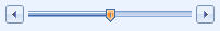
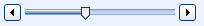
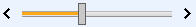
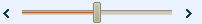
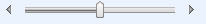
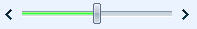
Skin
Controls the theme of the slider control.
Default: Vista
|
Available Skin Options |
Sample |
|
Black |
|
|
Default |
|
|
Forest |
|
|
Hay |
|
|
Office2007 |
|
|
Outlook |
|
|
Simple |
|
|
Sunset |
|
|
Telerik |
|
|
Vista (default) |
|
|
Web20 |
|
|
WebBlue |
|
SlideStep
Integer value that controls how much the slider moves when any of the handles are used.
Default: 1
TrackMouseWheel
Boolean value that enables whether or not the mouse wheel can be used to increment or decrease the slider control value.
Default: true
ShowValueBox
Boolean value that controls if a read-only textbox will be displayed that shows the numerical value of the slider control.
Default: false
ValueBoxSize
Integer value that controls the width of the value box if enabled.
Default: 50
ValueBoxCssClass
Controls the css style of the value box if enabled.
Default:
ValueBoxPosition
Controls the position of the value box relative to the slider control.
Options: Top, Bottom, Left, Right
Default: Right
DefaultValue
Text value that controls the default value.
Default:
OverrideHTML
A string value that provides a way to control how the slider control is displayed to the user. The slider and value box controls can be referenced by using the following:
Slider: [(Slider)]
ValueBox: [(Value)]
Submit (required) (Type="Submit")
This must be the last control in your Controls section
When referencing this control in the form, do so with "[(SUBMIT)]". Only one Submit button can exist per form.
Text (required) – Controls the text that is displayed in the submit button.
ImageButton (Optional) – Overrides the submit button with an image specified in the ImageUrl settings.
• Values: true/false
ImageUrl (Optional) – The URL to the image displayed in place of the Submit button.
• Example: http://www.site.com/images/imagebutton.jpg
UsePostMethod (Optional) – Force the form to use the POST method to pass its values to its Provider; necessary when your forms will contain a large amount of content.
• Values: true/false
Example
<Control type="Submit">
<Text>Save Me</Text>
< ImageButton>true/false</ ImageButton>
< ImageUrl>Url of image</ ImageUrl>
</Control>
TextBox
If you enable Validation, it will affect all BDFs that are installed on the page. If you want to enable validation for each individual BDF on the page, then you must use the Extra Method property for validation.
ControlName (required) – The name of the control that will be used for mapping and form design.
Control Size (Optional) – The width of the textbox displayed.
EditFormat (Optional) – Used to identify the edit format information.
DisplayFormat (Optional) – Gets or sets the format expression of the text displayed in the control when the control is inactivated (has no focus).
MaskExpression (Optional) – The string value which represents the mask the control will enforce.
DateTime (Optional) – Set to true to enable the date time picker. When enabled, the EditFormat must be specified.
DefaultText (Optional) – Text value which will populate the textbox control with a default value.
TextMode (Optional) – Controls how text is displayed in the control.
• SingleLine
• MultiLine
• Password
ReadOnly (Optional) – Set this property to True to set the control into a read-only state.
Height (Optional) – Controls the height of the control when using TextMode = MultiLine.
Style (Optional) – Represents a css style(s) to control the appearance of the control.
MaxLength (Optional) – Controls the maximum number of characters that can be input into the control.
ValidationRules (Optional) – A set of validation rules to apply to the control.
• Validation (required) – An individual validation rule to enforce.
o Type (Attribute) – Type of validation.
§ Required – Sets the control to a required field.
§ FormatExpression – Represents a regular expression.
o Message – The error message to display if validation fails. Use %FieldName% to substitute the name of the control in your error message.
§ Style (Attribute) – The css style to apply to the error message.
o ShowMessage (Optional) – Set to True to show the error message inline.
<Control type="TextBox">
<ControlName>Title</ControlName>
<ControlSize>150</ControlSize>
<DefaultText>Text Box Test</DefaultText>
<ValidationRules>
<Validation type="required">
<Value>true</Value>
</Validation>
</ValidationRules>
</Control>
ValidationSummary
HeaderText (Optional) – Controls the static text that will be displayed in the header of the summary control.
DisplayType (Optional) – Controls the summary style displayed.
o List
o Bullet
ShowSummary (Optional) – Controls whether or not the summary is rendered to the screen.
ShowMessageBox (Optional) – Controls whether or not a javascript message box will be displayed containing the summary information.
Style (Optional) – Controls the css style(s) of the summary display.
<Control type="ValidationSummary">
<HeaderText>The form contained the following errors:</HeaderText>
<DisplayType>List/bullet</DisplayType> (optional)
<ShowSummary>true/false</ShowSummary> (optional)
<ShowMessageBox>true/false</ShowMessageBox> true to display a javascript pop up
<Style>color:purple;</Style> (optional)
</Control>
WorkplaceLookup
ControlName (required) – The name of the control that will be used for Mapping and form design.
URLToXML (required) - The URL of the data source referenced by the Workplace Lookup to populate its choices. This property also supports the Common Use Variables stated at the beginning of this help topic.
LookupSelectionSetup (required) - The XML node location of the display text to be presented by the lookup to users as the choices for selection. This property can be specified in one of two ways:
1) A simple xpath query, represented by the following:
:xpath=(your xpath query here)
2) An XML string, which allows you to specify a more complex value consisting of multiple xpath queries and static text values. The XML string must contain a values root node with child value nodes representing your individual string pieces. The value nodes contain a single attribute type which tells the property whether it should treat the value as static text or an xpath query. The attribute values are type="text" or type="xpath".
Example:
:xpath=NewDataSet/Table1/Title
<values>
<value
type="xpath">NewDataSet/Table1/Title</value>
<value type="text"> -
</value>
<value
type="xpath">NewDataSet/Table1/Description</value>
</values>
ValueToStore (required) - The XML node location of the value that will be stored in the SharePoint list when the item is selected and the list item is saved. This property is optional; if no value is provided, the lookup will utilize the value represented by the URL to XML . This property can be specified in one of two ways:
1) A simple xpath query, represented by the following:
:xpath=(your xpath query here)
2) An XML string, which allows you to specify a more complex value consisting of multiple xpath queries and static text values. The XML string will contain a values root node with child value nodes representing your individual string pieces. The value nodes contain a single attribute type which tells the property whether it should treat the value as static text or an xpath query. The attribute values are type="text" or type="xpath".
Example:
:xpath=NewDataSet/Table1/Title
<values>
<value
type="xpath">NewDataSet/Table1/Title</value>
<value type="text"> -
</value>
<value
type="xpath">NewDataSet/Table1/Description</value>
</values>
InitialLookupText (Optional) - This property applies only when the DropDown lookup type is enabled. This is the text value the Workplace Lookup will display as the default or top selection in the drop-down of choices. This value also represents an empty value in the SharePoint list.
DefaultValue (Optional) – Controls the default text value when the lookup is search-enabled. When not enabled, the default value will control the default selected value in the drop-down.
URLToXMLFilter (Optional) – This value establishes a connection to the filtered data source connection. This only applies when the Search Enabled lookup type is enabled. This property also supports the Common Use Variables stated at the beginning of this help topic.
CreateNewItemUrl (Optional) - Use this property to specify the URL that will be opened so that users can create additional/new lookup Items without having to leave the current form. This property also supports the Common Use Variables stated at the beginning of this help topic. This is optional and is only utilized when the search-enabled lookup type is being used.
SearchEnabledLookup (Optional) – Set this property to True to enable the search-enabled lookup.
ReturnAllItems (Optional) – Set this property to True when utilizing the Search-Enabled lookup type to force a user to search on a value before any data is returned. This can prevent users from straining a web server when working with lookups that have large data sets.
AppendUpdateFields (Optional) – Set this property to True to see any additional update field values with in the grid when using the search-enabled lookup.
Size (Optional) – Controls the width of the textbox control when the lookup is search-enabled.
StaticItems (Optional) – A set of static items to append to the lookup dropdown.
Xml Reference
<StaticItems append="true/false">
<Item>
<DisplayValue> </DisplayValue>
<SaveValue> </SaveValue>
</Item>
</StaticItems>
Append – Set to True to have the items appended to the data bound items in the lookup.
DisplayValue – The value to display in the lookup drop-down lookup control.
SaveValue – The value that will be saved when the lookup item is selected.
UpdateFields (Optional) – An XML string property that allows a user to configure the lookup so that when a value is selected, additional fields in the form are updated with content configured from the data source.
Xml Reference
<UpdateFields>
<Field>
<Title>FieldName</Title>
<FieldValue>
1):xpath=xpath
value
2)<values>
<value type="xpath/text">xpath value or
text</value>
</values>
</FIeldValue>
</Field>
</UpdateFields>
Title – The name of the database field to update.
FieldValue – The value to update the database field with.
Example:
<Control type="WorkplaceLookup">
<ControlName>TestField</ControlName>
<URLToXML>http://devrapps.corasworks.net/dba/ts/Forms/tasks.aspx</URLToXML>
<LookupSelectionSetup>:xpath=NewDataSet/Table1/Title</LookupSelectionSetup>
<CreateNewItemURL>http://www.mysite.com/newform.aspx </CreateNewItemURL>
<ValueToStore>
<values>
<value type="xpath">NewDataSet/Table1/Title</value>
</values>
</ValueToStore>
<SearchEnabledLookup>false</SearchEnabledLookup>
<InitialLookupText>Test Me</InitialLookupText>
<AppendUpdateFields>false</AppendUpdateFields>
<UpdateFields>
<Field>
<Title>AddField</Title>
<FieldValue>:xpath=NewDataSet/Table1/Status</FieldValue>
</Field>
</UpdateFields>
</Control>
WorkplaceMultiLookup
ControlName (required) – The name of the control that will be used for mapping and form design.
URLToXML (required) - The URL of the data source referenced by the Workplace Lookup to populate its choices. This property also supports the Common Use Variables stated at the beginning of this help topic.
LookupSelectionSetup (required) - The XML node location of the display text to be presented by the lookup to users as the choices for selection. This property can be specified in one of two ways:
1) A simple xpath query, represented by the following:
:xpath=(your xpath query here)
2) An XML string, which allows you to specify a more complex value consisting of multiple xpath queries and static text values. The XML string must contain a values root node with child value nodes representing your individual string pieces. The value nodes contain a single attribute type which tells the property whether it should treat the value as static text or an xpath query. The attribute values are type="text" or type="xpath".
Example:
:xpath=NewDataSet/Table1/Title
<values>
<value
type="xpath">NewDataSet/Table1/Title</value>
<value type="text"> -
</value>
<value
type="xpath">NewDataSet/Table1/Description</value>
</values>
ValueToStore (required) - The XML node location of the value that will be stored in the SharePoint list when the item is selected and the list item is saved. This property is optional; if no value is provided, the lookup will utilize the value represented by the URL to XML . This property can be specified in one of two ways:
1) A simple xpath query, represented by the following:
:xpath=(your xpath query here)
2) An XML string, which allows you to specify a more complex value consisting of multiple xpath queries and static text values. The XML string will contain a values root node with child value nodes representing your individual string pieces. The value nodes contain a single attribute type which tells the property whether it should treat the value as static text or an xpath query. The attribute values are type="text" or type="xpath".
Example:
:xpath=NewDataSet/Table1/Title
<values>
<value
type="xpath">NewDataSet/Table1/Title</value>
<value type="text"> -
</value>
<value
type="xpath">NewDataSet/Table1/Description</value>
</values>
DefaultValue (Optional) – Controls the default text value when the lookup is search-enabled. When not enabled, the default value will control the default selected value in the drop-down.
URLToXMLFilter (Optional) – This value establishes a connection to the filtered data source connection. This only applies when the Search Enabled lookup type is enabled. This property also supports the Common Use Variables stated at the beginning of this help topic.
CreateNewItemUrl (Optional) - Use this property to specify the URL that will be opened so that users can create additional/new lookup items without having to leave the current form. This property also supports the Common Use Variables stated at the beginning of this help topic. This is optional and is only utilized when the search-enabled lookup type is being used.
ReturnAllItems (Optional) – Set to True when utilizing the Search-Enabled lookup type to force a user to search on a value before any data is returned. This can prevent users from straining a web server when working with lookups that have large data sets.
Size (Optional) – Controls the width of the textbox control when the lookup is search-enabled.
StaticItems (Optional) – A set of static items to append to the lookup dropdown.
Xml Reference
<StaticItems append="true/false">
<Item>
<DisplayValue> </DisplayValue>
<SaveValue> </SaveValue>
</Item>
</StaticItems>
Append – Set to true to have the items appended to the data bound items in the lookup.
DisplayValue – The value to display in the lookup drop-down lookup control.
SaveValue – The value that will be saved when the lookup item is selected.
Example
<Control type="WorkplaceLookupMulti">
<ControlName>TestField</ControlName>
<URLToXML>http://devrapps.corasworks.net/dba/ts/Forms/Tasks.aspx</URLToXML>
<LookupSelectionSetup>:xpath=NewDataSet/Table1/Title</LookupSelectionSetup>
<CreateNewItemUrl><%SiteURL%>/Lists/Tasks/NewForm.aspx</CreateNewItemUrl>
<ReturnAllItems>true</ReturnAllItems>
<ValueToStore>:xpath=NewDataSet/Table1/Title</ValueToStore>
<Rows>4</Rows>
<Size>500</Size>
</Control>
Controls Example
<Control type="TextBox">
<ControlName>PriorityName</ControlName>
<ControlSize>150</ControlSize>
<DefaultText/>
<ValidationRules>
<Validation type="required">
<Value>true</Value>
</Validation>
</ValidationRules>
</Control>
<Control type="Submit">
<Text>Save Priority</Text>
</Control>
FormResponse (required)
This controls the response the user will see after the Submit button is clicked. For each response you would like to create, specify each within its own <Response> tags. The default response must come last.
XML Reference
<Response alert="true/false" sendemail="true/false">
<ResponseText/>
<Message/>
<RedirectUrl/>
</Response>
Alert
This indicates if a pop up alert message box will be displayed after a save is completed.
Values: true/false
SendEmail
This indicates if an Email will be generated after save. You must setup the Emailer Properties in order to use this function.
Values: true/false
ResponseText
This is the text that will be searched for within the response from the data provider after save. For instance, if you want check for an error, you would enter the text "error". If you want to have this as the default response, keep this node empty.
Message
This is the message displayed to the user in the pop-up window. You can use the use the ID returned by the Data Provider by using the "%RecordID%" variable within your message. If you use the variable, you must setup the Xpath for new record ID property. %Self% to redirect the form to itself or %Referrer%
RedirectUrl
This is the URL that the user will be redirected to after a save is complete and a message is displayed. This is deactivated if you use the ShowResponse parameter in the URL. You can use the %Self% variable to redirect to itself or %Referrer% to redirect to the referring page. If "Source=URL" has been specified in the page URL, then the user will be redirected to the URL specified in the Source parameter. If not specified, then no redirection will occur.
FormResponse Example
<FormResponses>
<Response alert="true" sendemail="true">
<ResponseText>ID</ResponseText>
<Message>Complete %RecordID%</Message>
<RedirectUrl>%Self%</RedirectUrl>
</Response>
<Response>
<ResponseText>Error</ResponseText>
<Message>Project Not Saved</Message>
<RedirectUrl/>
</Response>
<Response alert="false" sendemail="false">
<ResponseText>NewDataSet</ResponseText>
<Message/>
<RedirectUrl>%Referrer%</RedirectUrl>
</Response>
</FormResponses>
EditForm Mappings (required)
For each control you want to use in your form, specify the control within its own <Control> node.
XML Reference
<Control>
<ControlName></ControlName>
<NodePath></NodePath>
<Type></Type>
<Format></Format>
</Control>
ControlName (required)
The name of the Control that will be used within the form. The control name must match a control specified in the Controls section of the form or the Extra Controls property.
NodePath (required)
The xpath to the data to be inserted into the Control. Data returned from the provider for an item/edit detail action URL is in XML. As such, you must specify the path to the node of data that will be identified as the selected item within the control.
Type
The type of data being collected.
Value
• datetime
• other
Format
The format of the data being collected.
Example
• MMMM yyyy - Semptember 2007
o Must have a type of "datetime"
• ${0} - $1.00
o Must have a type of "other"
o Always use {0} to indicate the data collected
Mapping Example
<Control>
<ControlName>Expenses</ControlName>
<NodePath>NewDataSet/Data/Expenses</NodePath>
<Type>other</Type>
<Format>${0}</Format>
</Control>
<Control>
<ControlName>BillableHours</ControlName>
<NodePath>NewDataSet/Data/Billable_Hours</NodePath>
</Control>
DisplayForm Design
This is the HTML used to display your form. The use of "&" within an encoded value is not permitted. (E.g., ) Unlike the Form Design, you will not use the Submit control within this HTML.
Control Substitution
This allows you to specify and place a control at a specific location on the page.
[(CONTROLNAME)] = The name of the Controls specified in the "<ControlName>" node of the control you want to display.
Variable Substitution
REPLACEMENTVARIABLENAME = The Name of the Replacement Variable that is captured from a post into the form. For example, if you want to use or show an ID in the form design that is passed into the page and you have specified it as "%CWID%" in your replacement variables, you can use "%CWID%" within the Design HTML. This requires the Replacement Variables property.
Design Example
<table cellpadding="0" cellspacing="0" style="width: 500px">
<tr>
<td class="ms-formlabel" style="width: 116px"><b>Priority Name:</b></td>
<td class="ms-formbody">[(PriorityName)]<![CDATA[ ]]></td>
</tr>
</table>
DisplayForm Mappings
Allows you to control what data is displayed in each control when a user views data. (E.g., form.aspx?cwformtype=display)
For each control you want to use in your form, specify the control within its own <Control> node.
XML Reference
<Control>
<ControlName></ControlName>
<NodePath></NodePath>
<Type></Type>
<Format></Format>
</Control>
ControlName (required)
The name of the Control that will be used within the form. The control name must match a control specified in the Controls section of the form or the Extra Controls property.
NodePath (required)
The xpath to the data to be inserted into the Control. Data returned from the provider for an item/edit detail action URL is in XML. As such, you must specify the path to the node of data that will be identified as the selected item within the control.
Type
The type of data being collected.
Value
• datetime
• other
Format
The format of the data being collected.
Example
• MMMM yyyy - Semptember 2007
o Must have a type of "datetime"
• ${0} - $1.00
o Must have a type of "other"
o Always use {0} to indicate the data collected
Mapping Example
<Control>
<ControlName>Expenses</ControlName>
<NodePath>NewDataSet/Data/Expenses</NodePath>
<Type>other</Type>
<Format>${0}</Format>
</Control>
<Control>
<ControlName>BillableHours</ControlName>
<NodePath>NewDataSet/Data/Billable_Hours</NodePath>
</Control>
LockFormType
Used to manage the form type that will always be displayed even if CWFormType is used.
Values
• new
• edit
• display
LockFormType Example
<LockFormType>display</LockFormType >
BusyHTML
Controls the HTML displayed after the Submit button is selected and the user is awaiting a response.
BusyHTML Example
<center>Updating Data…</center>
Example Form XML
<Form>
<Design>
<table cellpadding="0" cellspacing="0" style="width: 500px">
<tr>
<td class="ms-formlabel" style="width: 116px"><b>Priority Name:</b></td>
<td class="ms-formbody">[(PriorityName)]<![CDATA[ ]]></td>
</tr>
<tr>
<td class="ms-formlabel" style="width: 116px"><![CDATA[ ]]></td>
<td class="ms-formbody">[(SUBMIT)]<![CDATA[ ]]></td>
</tr>
</table>
</Design>
<Controls>
<Control type="TextBox">
<ControlName>PriorityName</ControlName>
<ControlSize>150</ControlSize>
<DefaultText/>
<Required>true</Required>
</Control>
<Control type="Submit">
<Text>Save Priority</Text>
</Control>
</Controls>
<FormResponses>
<Response alert="false" sendemail="false">
<ResponseText></ResponseText>
<Message/>
<RedirectUrl>PriorityView.aspx</RedirectUrl>
</Response>
</FormResponses>
<EditForm>
<Mappings>
<Control>
<ControlName>PriorityName</ControlName>
<NodePath>NewDataSet/Data/PriorityName</NodePath>
</Control>
</Mappings>
</EditForm>
<DisplayForm>
<Design>
<table cellpadding="0" cellspacing="0" style="width: 500px">
<tr>
<td class="ms-formlabel" style="width: 116px"><b>Priority Name:</b></td>
<td class="ms-formbody">[(PriorityName)]</td>
</tr>
</table>
</Design>
<Mappings>
<Control>
<ControlName>PriorityName</ControlName>
<NodePath>NewDataSet/Data/PriorityName</NodePath>
</Control>
</Mappings>
</DisplayForm>
</Form>