Setup Properties
The following Setup Properties are available for use with the Mini Calendar. Click on a link to go directly to that section.
Calendar Setup XML
CancelButtonCaption
Type: String
Text displayed on the Cancel button within Fast Navigation.
CellAlign
Type: String
Controls the horizontal alignment of the date cells content inside the calendar area.
• Center
• Left
• Justify
• NotSet
• Right
CellDayFormat
Type: String
Controls the format string that will be applied to the dates presented in the calendar area.
CellVAlign
Type: String
Controls the vertical alignment of the date cell content inside the calendar area.
• Bottom
• Middle
• NotSet
• Top
ColumnHeaderImage
Type: String
Controls the image displayed for the column header element.
ColumnHeaderText
Type: String
The text displayed for the column header element.
CssClass
Type: String
The css class used on days that have events.
CultureInfo
Type: String
Controls the CultureInfo instance that represents information about the culture of this calendar.
DateRangeSeperator
Type: String
Controls the separator string that will be put between start and end months in a multi-view title.
DayCellToolTipFormat
Type: String
Controls the format string that is applied to the days cells tooltip.
DayNameFormat
Controls the display formats for the days of the week used as selectors.
• FirstLetter
• FirstTwoLetters
• Full
• Short
• Shortest
EnableEmbeddedSkins
Controls the value, indicating whether to render links to the embedded skins or not.
EnableMonthYearFastNavigation
Type: Boolean
Controls whether the month/year fast navigation controls in the title section are enabled.
EnableMultiSelect
Type: Boolean
Used to allow multiple date selection.
EnableNavigation
Type: Boolean
Controls whether the navigation controls in the title section are displayed.
EnableTodayButtonSelection
Type: Boolean
Enables the display of the Today Button within Fast Navigation.
EnableViewSelector
Controls whether a selector for the entire MonthView will appear on the calendar.
EndDate (Required)
Type: String
The column used as the end date for the event.
EventTitle (Required)
Type: String
The column used as the event title.
FastNavigationNextImage
Type: String
Controls the name of the image that is displayed for the next month fast navigation control.
FastNavigationNextText
Type: String
Controls the text displayed for the fast navigation next month control.
FastNavigationNextToolTip
Type: String
Controls the text displayed as a tooltip for the fast navigation next month control.
FastNavigationPrevImage
Type: String
Controls the name of the image that is displayed for the previous month fast navigation control.
FastNavigationPrevText
Type: String
Controls the text displayed for the fast navigation previous month control.
FastNavigationPrevToolTip
Type: String
Controls the text displayed as a tooltip for the fast navigation previous month control.
FirstDayOfWeek
Type: String
Specifies the day to display as the first day of the week on the calendar.
• Default
• Sunday
• Monday
• Tuesday
• Wednesday
• Thursday
• Friday
• Saturday
FocusedDateColumn
Type: Number
Controls the column index where the focused day within the calendar will be positioned inside a multi view area.
FocusedDateRow
Type: Number
Controls the row index where the focused day within the calendar will be positioned inside a multi view area.
Height
Type: Number
The height of the calendar, measured in pixels.
ImagesPath
Type: String
Controls default path for the grid images when EnableEmbeddedSkins is set to false.
MonthLayout
Type: String
Controls the predefined pairs of rows and columns.
• Layout_14columns_x_3rows
• Layout_14rows_x_3columns
• Layout_21columns_x_2rows
• Layout_21rows_x_2columns
• Layout_7columns_x_6rows
• Layout_7rows_x_6columns
MultiViewColumns
Type: Number
Controls the count of columns to be displayed by a multi month calendar.
MultiViewRows
Type: Number
Controls the count of rows to be displayed by a multi month calendar.
NavigationNextImage
Type: String
Controls the name of the image that is displayed for the next month navigation control.
NavigationNextText
Type: String
Controls the text displayed for the next month navigation control.
NavigationNextToolTip
Type: String
Controls the text displayed as a tooltip for the next month navigation control.
NavigationPrevImage
Type: String
Controls the name of the image that is displayed for the previous month navigation control.
NavigationPrevText
Type: String
Controls the text displayed for the previous month navigation control.
NavigationPrevToolTip
Type: String
Controls the text displayed as a tooltip for the previous month navigation control.
OKButtonCaption
Type: String
The text displayed on the OK button within Fast Navigation.
Orientation
Type: String
Controls the orientation (rendering direction) of the calendar.
• RenderInRows
• RenderInColumns
RowHeaderImage
Type: String
Controls the image displayed for the row header element.
RowHeaderText
Type: String
Controls the text displayed for the row header element.
SelectedDate
Type: Date
Controls the currently selected date.
ShowColumnHeaders
Type: Boolean
Controls whether or not column headers will appear on the calendar.
ShowRowHeaders
Type: Boolean
Controls whether or not row headers will appear on the calendar.
SingleViewColumns
Type: Number
Controls the count of columns to be displayed by a single calendar.
SingleViewRows
Type: Number
Controls the count of rows to be displayed by a single calendar.
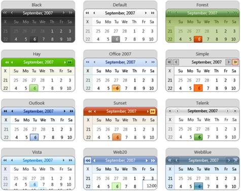
Skin
Type: String
The skin to use when rendering the calendar.
• Black
• Default
• Forest
• Hay
• Office2007
• Outlook
• Simple
• Sunset
• Telerik
• Vista
• Web20
• WebBlue
A sample of each is shown here:
StartDate (Required)
Type: String
The column used as the start date for the event.
TitleAlign
Type: String
Controls the horizontal alignment of the calendar title.
• Center
• Left
• Justify
• NotSet
• Right
TitleFormat
Type: String
Controls the format string that is applied to the calendar title.
TodayButtonCaption
Type: String
The text displayed on the Today button within Fast Navigation.
URL
Type: String
The URL of the page to go to when a user clicks on a day inside the calendar. The URL will automatically append the selected date.
UseColumnHeadersAsSelectors
Type: Boolean
Controls whether to use the days of the week.
UseRowHeadersAsSelectors
Type: Boolean
Controls whether to use the number of the week.
ViewSelectorImage
Type: String
Controls the image displayed for the complete selection element in the view selector cell.
ViewSelectorText
Type: String
Controls the text displayed for the complete selection element in the view selector cell.
Width
Type: Number
The width of the calendar, measured in pixels.
Example:
<MCSetup>
<Setup>
<ShowRowHeaders>False</ShowRowHeaders>
<Skin>Inox</Skin>
<EventTitle>Title</EventTitle>
<StartDate>Start Time</StartDate>
<EndDate>End Time</EndDate>
<URL>http://site1.com/Calendar.aspx?CalView=dayview&CalDate=</URL>
</Setup>
</MCSetup>
Convert XML
Use this property convert fields collected from the external XML from a string to a different type.
Example:
<Convert>
<Column>
<ColumnName>Start Date</ColumnName>
<ColumnType>System.DateTime</ColumnType>
</Column>
<Column>…</Column>
</Convert>
ColumnName (required) – String
The name of the column you want to convert.
ColumnType (required) – String
The System Type you want to convert the column to.
Options:
• System.Boolean
• System.Byte
• System.Char
• System.DateTime
• System.Decimal
• System.Double
• System.Int16
• System.Int32
• System.Int64
• System.SByte
• System.Single
• System.String
• System.TimeSpan
• System.UInt16
• System.UInt32
• System.UInt64
TableName (Optional) – String
The name of the table which contains the column to convert. The TableName comes from the Table node used in the XML. For instance if your xml looks like “<Data><Title>Hello</Title></Data><Data><Title>World</Title></Data>” the name of your table is “Data”.
CW Bold Class
Controls the bold effect of days that have events on the Mini Calendar.
Example:
<style>.CWCalBoldDays {font-weight: bold;}</style>
Enforce Post Input
When enabled, this property forces information to be passed into the page a post request, rather than a get request. This disables the ability to add ?Parameter=Value to the page.
Pass Through XML
When enabled, this property will pass page parameters onto the page specified in the "URL To XML" property. This supports the Common Use Variables stated at the beginning of this help topic. You must encode the < and > symbol when using the parameters (e.g., < < and > >).
Example:
<PassThrough>
<Pass>
<PTType>get</PTType>
<PTRequest>SearchString</PTRequest>
<PTName>SearchString</PTName>
<PTDefault>[Me]</PTDefault>
</Pass>
</PassThrough>
PTDefault (Optional) – String
The default text that will be sent to the page from which data is being requested, if the parameter is not passed into the page.
PTName (Required) – String
The name of the parameter to be passed onto the page from which data is being requested.
PTRequest (Required) – String
The name of the parameter being received by the page.
PTType (Required) – String
Controls the type of pass through. Use "post" to store the parameters in the header of your request, or "get" to store them in the URL.
Options:
• post
• get
URL To XML
The URL to the data source that the grid will be data bound to. This property also supports the Common Use Variables stated at the beginning of this help topic.
Default: empty
Example:
http://domain.com/GridDataSources/Tasks
<%SiteURL%>/GridDataSources/Tasks