Setup Properties
The Setup Properties listed below are available for use. Click on a link to go directly to that section.
URL to Datasource
The URL to the data source that the grid will reference for data to display. This property also supports the Common Use Variables stated at the beginning of this help topic.
Default: empty
Examples:
http://domain.com/GridDataSources/Tasks.aspx
<%SiteURL%>/Providers/Tasks.aspx
Mapping XSL
Used to specify the XSL to be used to format the content collected before it is displayed within the web part. For instance, if you wish to display an item as a link, you would use XSL to create a link to an item from the data collected.
This property also supports the Common Use Variables stated at the beginning of this help topic.
Options:
• "[file]="
o Use this option to specify a URL to an XSL Stylesheet Template
o Example: [file]=<%SiteURL%>/Connections/TasksXSL.xml
• <xsl:stylesheet>…</xsl:stylesheet>
o Use this option to specify the XSL Stylesheet XML directly within the property
o Example:
<xsl:stylesheet version="1.0" xmlns:xsl="http://www.w3.org/1999/XSL/Transform">
<xsl:template match="/">
<Data>
<xsl:for-each select="NewDataSet/Table1">
<Item>
<Title><xsl:value-of select="Title" /></Title>
</Item>
</xsl:for-each>
</Data>
</xsl:template>
</xsl:stylesheet>
Grid Setup XML
This XML property is used to define the features and functions of the grid. It can contain the elements listed below. Most are Boolean values, so they can be set to true/false to be turned on/off.
Example:
<gc>
<c>
<AutoGenerateColumns>false</AutoGenerateColumns>
<AllowPaging>true</AllowPaging>
<AllowSorting>true</AllowSorting>
<AllowFilteringByColumn>false</AllowFilteringByColumn>
<AllowMultiRowSelection>true</AllowMultiRowSelection>
<AllowKeyboardNavigation>true</AllowKeyboardNavigation>
<AllowRowSelect>true</AllowRowSelect>
<ShowFooter>true</ShowFooter>
<ShowStatusBar>true</ShowStatusBar>
<Skin>Web20</Skin>
<AllowColumnResize>true</AllowColumnResize>
<AllowColumnsReorder>true</AllowColumnsReorder>
<AllowResizeToFit>true</AllowResizeToFit>
<AllowRowResize>true</AllowRowResize>
<EnableHeaderContextMenu>true</EnableHeaderContextMenu>
<EnableHeaderContextFilterMenu>true</EnableHeaderContextFilterMenu>
<EnableRealTimeResize>True</EnableRealTimeResize>
<AllowScroll>True</AllowScroll>
</c>
</gc>
AutoGenerateColumns
A Boolean value that, when set to true, will create a column for every item in the data source. If this value is set to false, the Column XML property must be populated.
AllowPaging
A Boolean value that specifies whether the grid should display all of the items at once or display them in page increments.
AllowSorting
A Boolean value that specifies whether or not the user is able to click on a column to sort the results by the values in that column.
AllowFilteringByColumn
A Boolean value that, when set to true, will show a filter bar at the top of the grid.
AllowMultiRowSelection
A Boolean value that specifies whether or not the user is able to select more than one item at a time.
AllowKeyboardNavigation
A Boolean value that, when set to true, allows end users to navigate through the menu structure using the arrow keys and select grid items by using the space bar.
AllowRowSelect
A Boolean value that specifies whether or not the user is able to select an item in the grid.
Show Footer
A Boolean value that controls whether or not a footer is displayed at the bottom of the grid.
ShowStatusBar
A Boolean value that controls whether or not a status bar is displayed at the bottom of the grid.
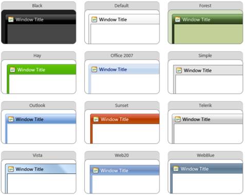
Skin
A Boolean value that controls the skin used in the window. In the example provided above, this is set to Web20.
• Black
• Default
• Forest
• Hay
• Office2007
• Outlook
• Simple
• Sunset
• Telerik
• Vista
• Web20
• WebBlue
A sample of each is shown here:
AllowColumnResize
A Boolean value that controls whether or not the user can drag on the side of a column to resize it.
AllowColumnsReorder
A Boolean value that controls whether or not the user can drag a column to a different location in the grid.
AllowResizeToFit
A Boolean value that specifies whether or not an option is available to the user to automatically resize the columns to fit the displayed data.
AllowRowResize
A Boolean value that controls whether or not the user can drag on the top or bottom of a row to resize it.
EnableHeaderContextMenu
A Boolean value that, when set to true, will show a context menu with options to sort, group, and show or hide columns. When this property is set to false, the standard browser context menu is used.
EnableHeaderContextFilterMenu
A Boolean value that controls whether or not filtering options are included in the context menu.
EnableRealTimeResize
A Boolean value that, when set to true, allows the user to drag on a column to resize it and show the results in WYSISYG mode.
OnGridCreated
The JavaScript function to call each time the page is refreshed.
AllowScroll
A Boolean value, set to True in the example provided above.
Convert XML
All of the data brought into the Grid Display Adapter comes in as text fields. This property is used to convert the fields collected from external XML to a different type of field. This is not required unless the data should be considered as something other than text.
Note: This procedure will occur after the Mapping XSL has been applied.
Example:
<convert>
<column>
<ColumnName>DueDate</ColumnName>
<ColumnType>System.DateTime</ColumnType>
</column>
</convert>
ColumnName (Required) – String
The name of the column you want to convert.
ColumnType (Required) – String
The System Type you would like to convert the column to.
Options:
• System.Boolean
• System.Byte
• System.Char
• System.DateTime
• System.Decimal
• System.Double
• System.Int16
• System.Int32
• System.Int64
• System.SByte
• System.Single
• System.String
• System.TimeSpan
• System.UInt16
• System.UInt32
• System.UInt64
TableName (Optional) – String
The name of the table that contains the column to convert. The TableName comes from the Table node used in the XML. For instance if your xml looks like this: “<Data><Title>Hello</Title></Data><Data><Title>World</Title></Data>” the name of your table is “Data”.
Column XML
This property is used to identify the columns to retrieve from the data source(s) to either display or reference in the Grid Display Adapter. Column that you want to use for grouping, filtering, etc. but do not want to display can be defined with Display set to false.
If the AutoGenerateColumns element in the Grid Setup XML property is set to false (so the grid will not create a grid column for every column in the data source), the Column XML property must be populated.
When working with actions, the following columns are required:
• Select
• SPItemID
• SPListID
• ObjSiteURL
The elements that can be used to identify the columns and define if and how they are displayed include:
• ColumnType – The supported values are Bound and ClientSelect.
• Unique Name
• HeaderStyleWidth
• HeaderStyleHorizontalAlign
• HeaderStyleVerticalAlign
• ItemStyleWidth
• ItemStyleCssClass
• DataField
• HeaderText
• SortExpression
• Display – Set this to False if you want to reference the column for filtering, grouping, etc., but do not want it to be displayed in the grid.
• Aggregate
Example:
<Columns>
<Column>
<ColumnType>ClientSelect</ColumnType>
<UniqueName>Select</UniqueName>
<HeaderStyleWidth>5%</HeaderStyleWidth>
<HeaderStyleHorizontalAlign>Center</HeaderStyleHorizontalAlign>
<HeaderStyleVerticalAlign>Center</HeaderStyleVerticalAlign>
<ItemStyleWidth>5%</ItemStyleWidth>
<ItemStyleCssClass>EditBoxCenter</ItemStyleCssClass>
</Column>
<Column>
<ColumnType>Bound</ColumnType>
<DataField>SPItemID</DataField>
<HeaderText>SPItemID</HeaderText>
<SortExpression>SPItemID</SortExpression>
<UniqueName>SPItemID</UniqueName>
<Display>False</Display>
<Aggregate>None</Aggregate>
</Column>
<Column>
<ColumnType>Bound</ColumnType>
<DataField>SPListID</DataField>
<HeaderText>SPListID</HeaderText>
<SortExpression>SPListID</SortExpression>
<UniqueName>SPListID</UniqueName>
<Display>False</Display>
<Aggregate>None</Aggregate>
</Column>
<Column>
<ColumnType>Bound</ColumnType>
<DataField>ObjSiteURL</DataField>
<HeaderText>ObjSiteURL</HeaderText>
<SortExpression>ObjSiteURL</SortExpression>
<UniqueName>ObjSiteURL</UniqueName>
<Display>False</Display>
<Aggregate>None</Aggregate>
</Column>
<Column>
<ColumnType>Bound</ColumnType>
<DataField>Title</DataField>
<HeaderText>Title</HeaderText>
<SortExpression>Title</SortExpression>
<UniqueName>Title</UniqueName>
<HeaderStyleWidth>40%</HeaderStyleWidth>
<ItemStyleWidth>40%</ItemStyleWidth>
<Aggregate>None</Aggregate>
<AllowFiltering>false</AllowFiltering>
</Column>
<Column>
<ColumnType>Bound</ColumnType>
<DataField>Status</DataField>
<HeaderText>Status</HeaderText>
<SortExpression>Status</SortExpression>
<UniqueName>Status</UniqueName>
<HeaderStyleWidth>30%</HeaderStyleWidth>
<ItemStyleWidth>30%</ItemStyleWidth>
<Aggregate>None</Aggregate>
<AllowFiltering>false</AllowFiltering>
</Column>
<Column>
<ColumnType>Bound</ColumnType>
<DataField>DueDate</DataField>
<HeaderText>Due Date</HeaderText>
<SortExpression>DueDate</SortExpression>
<UniqueName>DueDate</UniqueName>
<HeaderStyleWidth>20%</HeaderStyleWidth>
<ItemStyleWidth>20%</ItemStyleWidth>
<Aggregate>None</Aggregate>
<AllowFiltering>false</AllowFiltering>
</Column>
</Columns>
Style XML
This property is used to define the style to use for paging. In the example below, the page number and Next and Previous buttons are only displayed when there are next or previous items to be displayed because PagerStyleAlwaysVisible is set to false.
Example:
<ds>
<table>
<PagerStyleAlwaysVisible>false</PagerStyleAlwaysVisible>
<PagerStyleMode>NextPrevAndNumeric</PagerStyleMode>
</table>
</ds>
Grouping XML
This property is used to define any groups to be applied to the grid. The example below groups items by Status. The property should contain a root node value of Groups. The root node Groups should contain child node value Group, which will represent each grouping you want to set up in the grid.
<groups>
<group>
<FieldType>Group</FieldType>
<FieldName>Status</FieldName>
</group>
<group>
<FieldType>Select</FieldType>
<FieldName>Status</FieldName>
<FieldAlias>Status</FieldAlias>
<HeaderText>Status</HeaderText>
</group>
</groups>
Add Column XML
Used to add a column to the data collected from the external XML sources. This is useful if you want to set a default value for a column if the initial column is null, like a currency field.
Go to http://msdn2.microsoft.com/en-us/library/system.data.datacolumn.expression(VS.71).aspx for more information.
Example:
<AddColumn>
<Column>
<ColumnName>ZeroOfGroup1</ColumnName>
<ColumnType>System.Int32</ColumnType>
<Expression>IsNull(1*[Group Value0], 0)</Expression>
</Column>
</AddColumn>
ColumnName (Required) - String
The name of the column you want to add.
ColumnType (Optional) - String
The type of column you want to add. Please see Convert XML/ColumnType for available options.
Expression (Optional) - String
The expression used to store data within the column.
HTML Before
This property is required in order to use the Page Utility web part, which is often used to display action buttons above the grid. This is where the work is done to link in the actions.
NOTE: In order to use the GDA 2.0 with actions, you must have a specifically configured SharePoint List Data Provider and a specifically configured Page Utility web part. The appropriate configurations for each of these web parts are discussed in the Additional Web Part Configuration section. The discussion of the Page Utility references a JavaScript helper file. Click here to download that file.
Comments regarding the highlighted settings in the example below can be viewed by clicking on the highlight.
Example:
<script
src="CWAction.js"
></script>
<style>
.EditBoxCenter { text-align:center; }
.ActionButtonText{padding:12px 0px 0px 0px}
.ActionButton{width:130px; height:45px; background-image:url('../images/ActionButton.png'); background-repeat:no-repeat; text-align:center; color:white; font-family:Tahoma; font-size:Small}
</style>
<table
style="background-color:#F2F2F2; width:100%"
>
<tr>
<td
style="font-size:small; font-family:Tahoma; padding-left:5px; padding-right:5px; width:40px"
>Actions:</td>
<td
style="width:130px"
>
<div
style="cursor:hand"
class="ActionButton"
onClick="GetSelectedItemsForAction ('[<[GDA20AL]>]/ModifyCompany.cwad' , 'Modify Company ', 'GetMyGridContacts() ', 'ModalForm', 'SiteURL', 'ListId', 'UniqueId', -1);"
>
<div
class="ActionButtonText"
>Modify Job Title</div>
</div>
</td>
<td
style="width:130px"
>
<div
style="cursor:hand"
class="ActionButton"
onClick="GetSelectedItemsForAction('[<[GDA20AL]>]/UpdateStatus.cwad', 'Update Status', 'GetMyGridTasks()', 'ModalForm', '');"
>
<div
class="ActionButtonText"
>Update Status</div>
</div>
</td>
<td
style="width:auto"
></td>
</tr>
</table>
HTML After
This property can be left blank.
PassThrough XML
Use this property to pass page parameters onto the page specified in the URL to Datasource property. This supports the Common Use Variables stated at the beginning of this help topic. You must encode the < and > symbol when using the parameters (e.g., < < and > >).
Example:
<PassThrough>
<Pass>
<PTType>get</PTType>
<PTRequest>SearchString</PTRequest>
<PTName>SearchString</PTName>
<PTDefault>[Me]</PTDefault>
</Pass>
</PassThrough>
PTDefault (Optional) – String
The default text that will be sent to the page from which data is being requested, if the parameter is not passed into the page.
PTName (Required) – String
The name of the parameter that is to be passed onto the page from which data is being requested.
PTRequest (Required) – String
The name of the parameter that is being received by the page.
PTType (Required) – String
Controls the type of pass through. Use "post" to store the parameters in the header of the request or use "get" to store them in the URL.
Options:
• post
• get
Table Setup XML
This property is used to control whether or not the grid will show the group, and how many items to put on the page.
Example:
<m>
<t>
<ShowGroupFooter>true</ShowGroupFooter>
<PageSize>30</PageSize>
</t>
</m>